Art Adventurers Cover Reveal
8/1/2025
As an indie creator, I’m constantly juggling tasks I have no prior experience in. One day it’s layout and formatting, the next it’s merchandise design, social media, or casting for a no-budget web series. Sure, I cannot wait for the day I can hire experienced help for some of this, but there’s something about rolling up your sleeves and stepping into other roles. It gives you a whole new appreciation for just how important Every. Single. Role is in a creative project—whether it’s a no-budget film or a self-published children’s book.
My latest challenge? Book mockups.
If you don’t know, a mockup is a realistic photo of a product that doesn’t actually exist yet. When I had my clothing line years ago, I was lucky enough to find software that allowed me to place my designs on semi-realistic t-shirts. It made a huge difference in how professional everything looked. Before that, I used to literally print my designs onto old shirts, fold them strategically, and photograph them so they looked like the actual product.
So naturally, when I finished designing the Art Adventurers cover, I wondered if there was something similar for books.
There is.
I started with a few free mockup websites like 3D Book Cover Creator. While most of them were fast and easy to use, I quickly realized that the size and thickness we wanted isn't a common pairing. I decided to look into paid options, but the majority of those were designed for novels or nonfiction books, not 6x9 kids’ books. I also didn't love the blank background approach that most of the mockup generators use. I had hoped to have my book look like it was actually existing in someone's house. Not just in front of a white wall somewhere. The only site that gave me good backgrounds was Canva, but still, they were either too wide, too tall, or too thick.
I decided to go the graphic design route and create a mockup using GIMP and Clip Studio Paint. I managed to put a few mockups together, but I just couldn't get them to match the stock photos I'd chosen for backgrounds. Something always felt off. The lighting didn’t match the background photo. The filters clashed. I've done some color grading before, but none of it was to match footage from different sources.
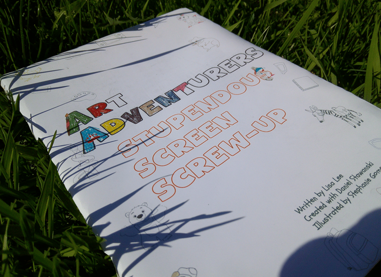
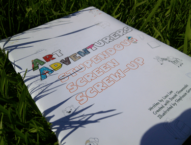
After a few time-consuming attempts at digital mockups, I decided to make my own. I'd recently come across the idea of a "dummy book." Normally used to test layout and pacing, it’s basically a physical version of your book before it’s printed. I figured I could use the same concept but in reverse. Instead of having a detailed interior, I'd fill it with blank pages and have our cover exhibited in all its glory.
After doing a little art supply inventory, I found an old pack of glossy sticker paper, cardboard from a case of soda, and a stack of cheap, lightweight printer paper. I decided to print the cover on the sticker paper, then stuck it to the cardboard and folded about 25 pages in half to form the inside. I added another piece of cardboard for the back, taped some extra paper over the spine, and voila.
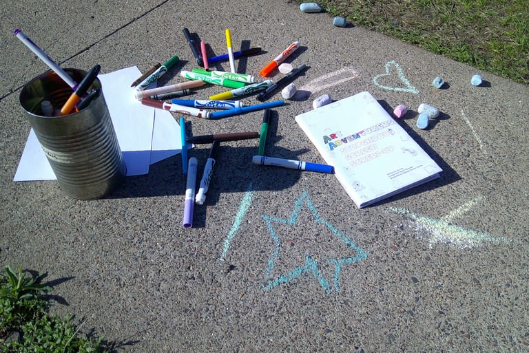
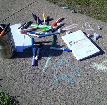
Then I took it outside with some sidewalk chalk and staged some photos. (I had planned to do a few indoor shots, but the lighting wasn’t great.)
All in all, it really wasn't difficult to do, and if you want something that looks more realistic or something more your personality, it is a good option. I did have to do some editing after I took the photos, but that's because I hadn't realized the seam from the spine was visible.
How do you think they turned out? I plan to do some more as we get closer to the book launch, but with some fun interior shots also. Until then, I think these give the photos personality in a way that digital mockups wouldn't have done. Do you like the idea of being able to take your own promotional photos using a DIY mockup, or do you prefer keeping your mockups digital? Do you know of a great children's book mockup generator? I'd love to check it out.
P.S. Want to hear more about my old clothing line? Let me know—I might just do a post about it!